Branding Thought Process for Sautoir Fine Jewellery
At the heart of Sautoir Fine Jewellery lies a vision of modern heirlooms—jewelry that doesn’t just decorate, but tells a story, connects generations, and becomes part of one's personal legacy. The name “Sautoir”, referencing the elegant, elongated necklace from the Art Deco era, was chosen with purpose. It evokes a sense of classic French luxury, graceful movement, and artistic refinement. The brand embodies the duality of strength and softness—where bold design meets delicate detailing.
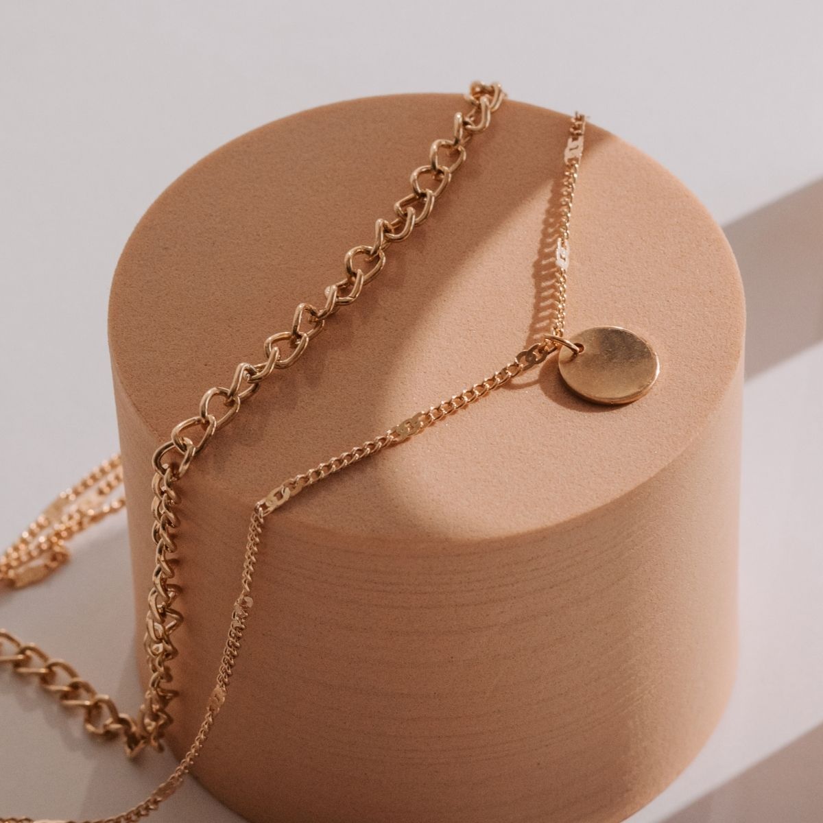
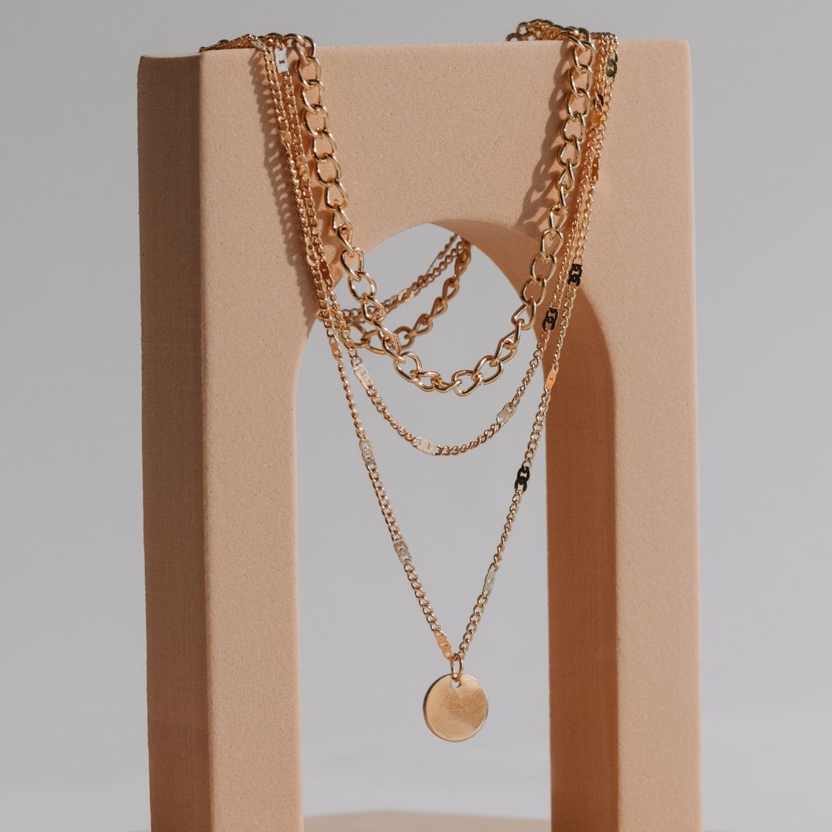
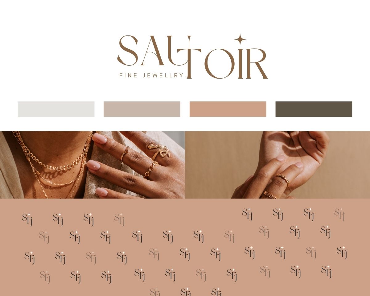
We began the branding process by exploring emotional and visual themes like Parisian chic, old-world elegance, and contemporary minimalism. These influenced every branding decision—from the typography that feels like it belongs in a high-end fashion house, to the idea of a monogram that could double as a hallmark engraved into gold. The logo was designed not just as a name, but as a mark of timeless identity—elegant enough for a velvet jewelry box, strong enough for digital and print, and memorable enough to live forever. The color palette and visual language were crafted to evoke luxury through subtlety—warm golds, creamy whites, and soft shadows replacing flashy contrast. The tone of voice across packaging, print, and digital is poetic yet grounded, celebrating slow fashion and mindful elegance.
On social media, Sautoir maintains a soft, editorial aesthetic with neutral tones, macro jewelry shots, and elegant textures like silk and marble. The visual style is clean and consistent—serif fonts for poetic quotes and product titles, sans-serif for understated, minimal captions. Content is rooted in authentic storytelling, highlighting behind-the-scenes craftsmanship, styling inspiration, and customer moments. This approach builds an aspirational yet relatable brand presence that not only elevates the product but also creates an emotional connection with the modern, thoughtful woman.