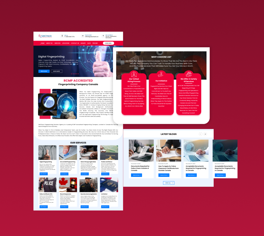
Visual Hierarchy & Readability
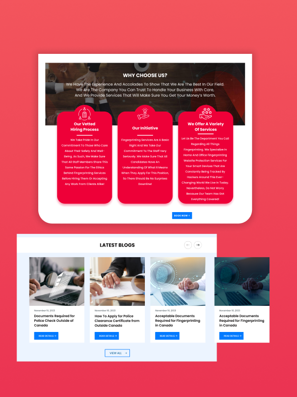
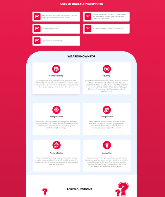
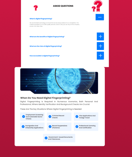
The original website struggled with heavy text blocks, poor line spacing, and an unclear structure, which made it difficult for users to quickly scan or grasp key information. The overuse of capital letters and inconsistent typography further reduced readability. To solve this, I recommended establishing a strong typographic hierarchy using defined heading levels, structured paragraphs, and visual content like icons to break the monotony. I applied usability heuristics and visual hierarchy principles to create a more scannable layout. To validate improvements, I conducted preference tests comparing the original and improved content structure, which showed a clear preference for the cleaner and more accessible design.