Play Open
Loading Please wait Loading Please wait Loading Please wait Loading Please wait Loading Please wait Loading Please wait
wEBSITE REDESIGN

MARITIME ACADEMY

  • Client MARITIME ACADEMY DESIGN UI UX

Maritime Academy is an online educational platform offering specialized training programs and diploma courses for careers in the maritime and yachting industries. Its core value lies in providing accredited, high-quality education via top-class institutions across the globe. The platform bridges the gap between aspiring maritime professionals and leading training institutes by offering verified course details, expert instructors, and user reviews—simplifying the journey from learner to maritime expert.

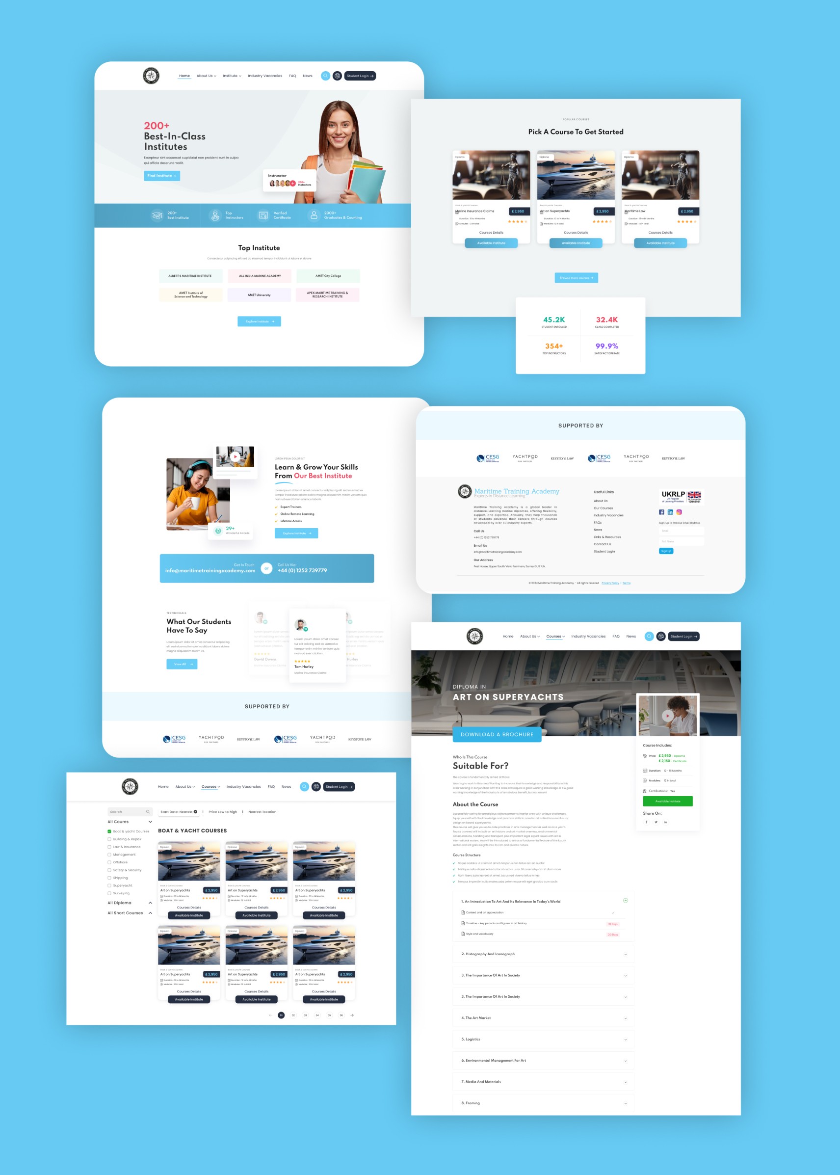
UI/UX & Content Placement Strategy

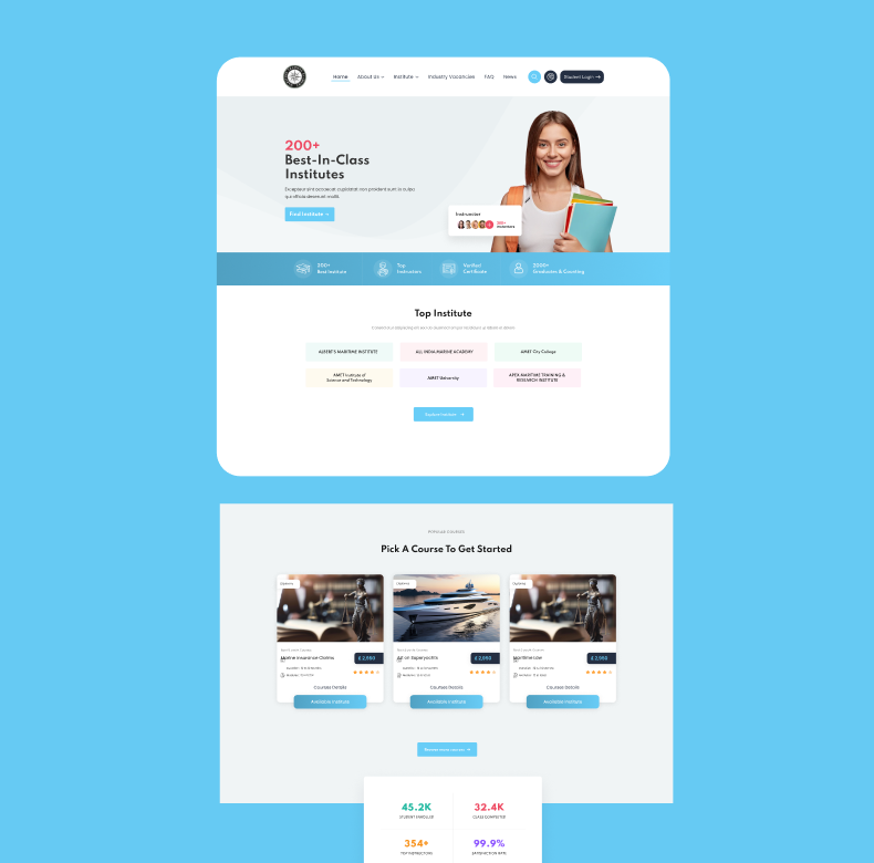
Hero & Homepage Layout (Trust + Clarity)

Header: Contains quick access to login, navigation, and support—ensures intuitive first interaction.

Hero Banner: Prominently displays USPs like “200+ Best-in-Class Institutes” to create instant trust and value. CTA buttons (“Explore Now”) are visible and inviting.

Top Institutes & Popular Courses: Clean card layout with color-coded categories enhances scannability.

Performance Metrics: Visually placed stats (e.g., 45.2K learners) add social proof and boost credibility.

Footer: Includes partner logos, contact info, and navigation links—reliable for reassurance and SEO.

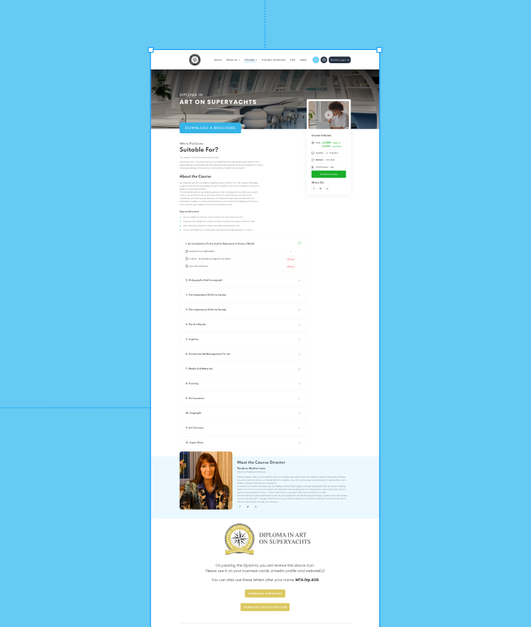
Course Detail Page (Conversion-Focused Design)

Banner with Course Title: Establishes clarity and relevance.

‘Download Brochure’ CTA: Strategically placed for immediate action.

Course Info + Instructor Bio: Combines trust elements (profile, reviews) with informative content.

Accordion for Course Modules: Keeps the page decluttered while allowing detailed exploration.

End CTA: “Download Application Form” — clearly nudging toward conversion.

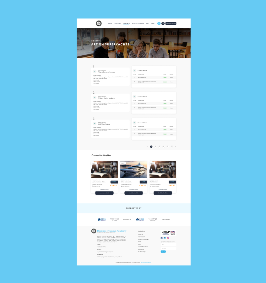
Institutes Listing Page (Powerful Filtering & Browsing)

Search Bar + Filter Controls: Simplifies decision-making with sorting by name, city, and status.

Table Layout: Supports advanced users with comprehensive data visibility.

Pagination + Course Cards Below: Smart blend of data-heavy and visual navigation.

UI/UX Highlights

  • Consistency: Colors, fonts, and UI elements maintain a professional, trustworthy brand identity.

  • Readability: Ample white space, legible fonts, and content hierarchy improve scanning and comprehension.

  • Conversion-Focused UX: CTAs like “Download Brochure” and “Contact Institute” are well-positioned and action-oriented.

  • Mobile Consideration: UI elements like cards, accordions, and buttons are likely optimized for responsive use (to be verified via prototype or dev preview).

Related projects

You may also be interested
in these projects

Discover more of our work that blends strategy, storytelling, and stunning design. Each project is crafted with care, tailored to unique brand goals, and driven by creative impact. Explore how Opulance transforms ideas into powerful visual experiences across industries.