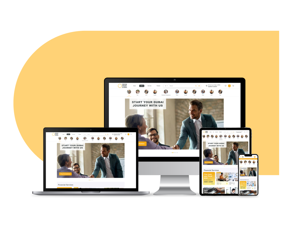
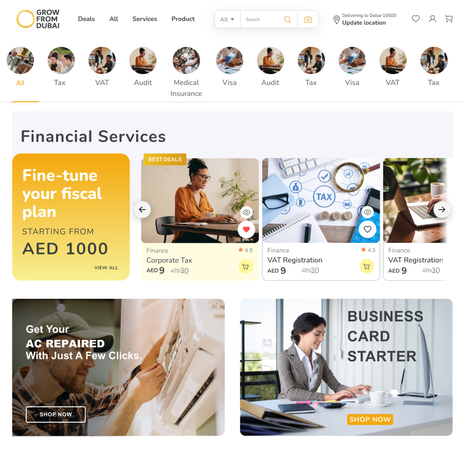
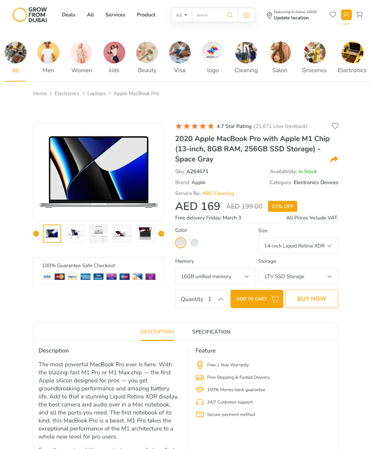
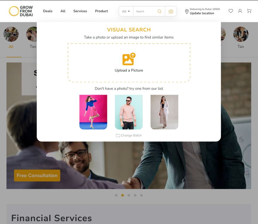
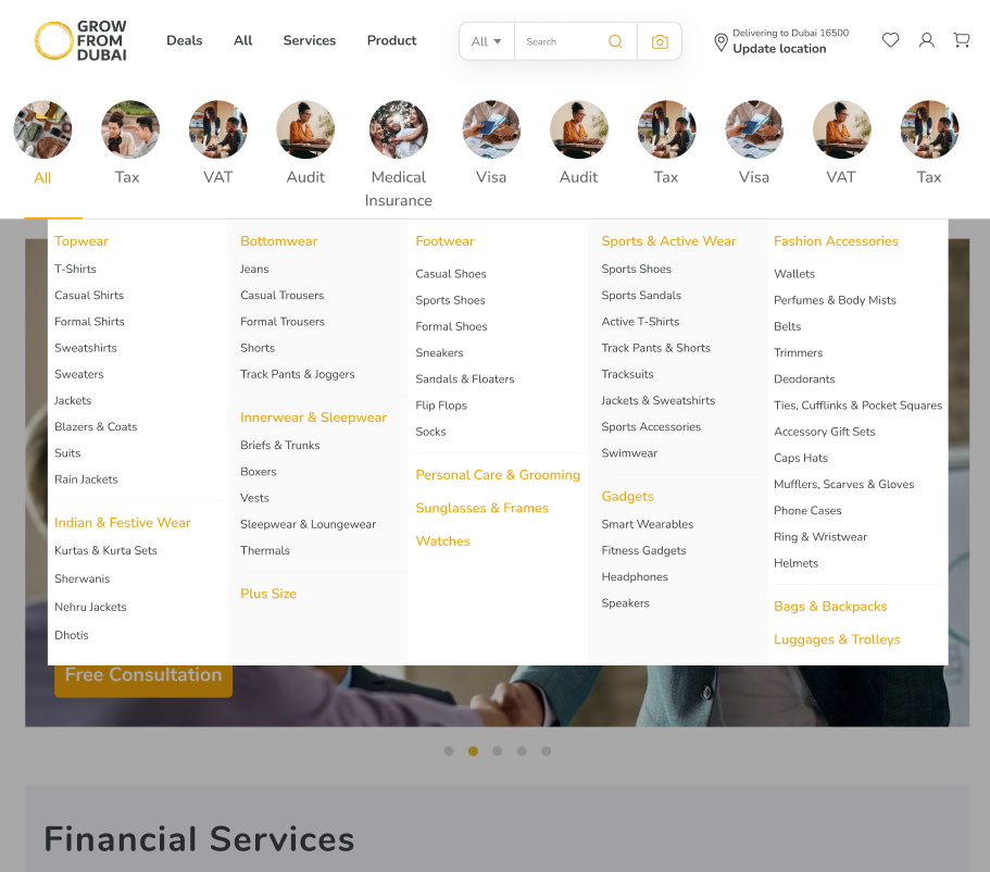
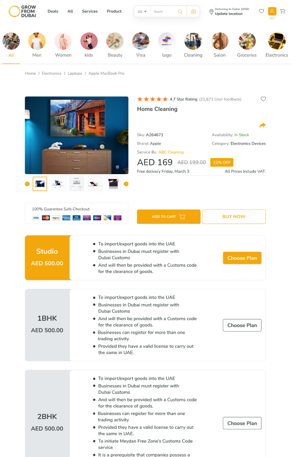
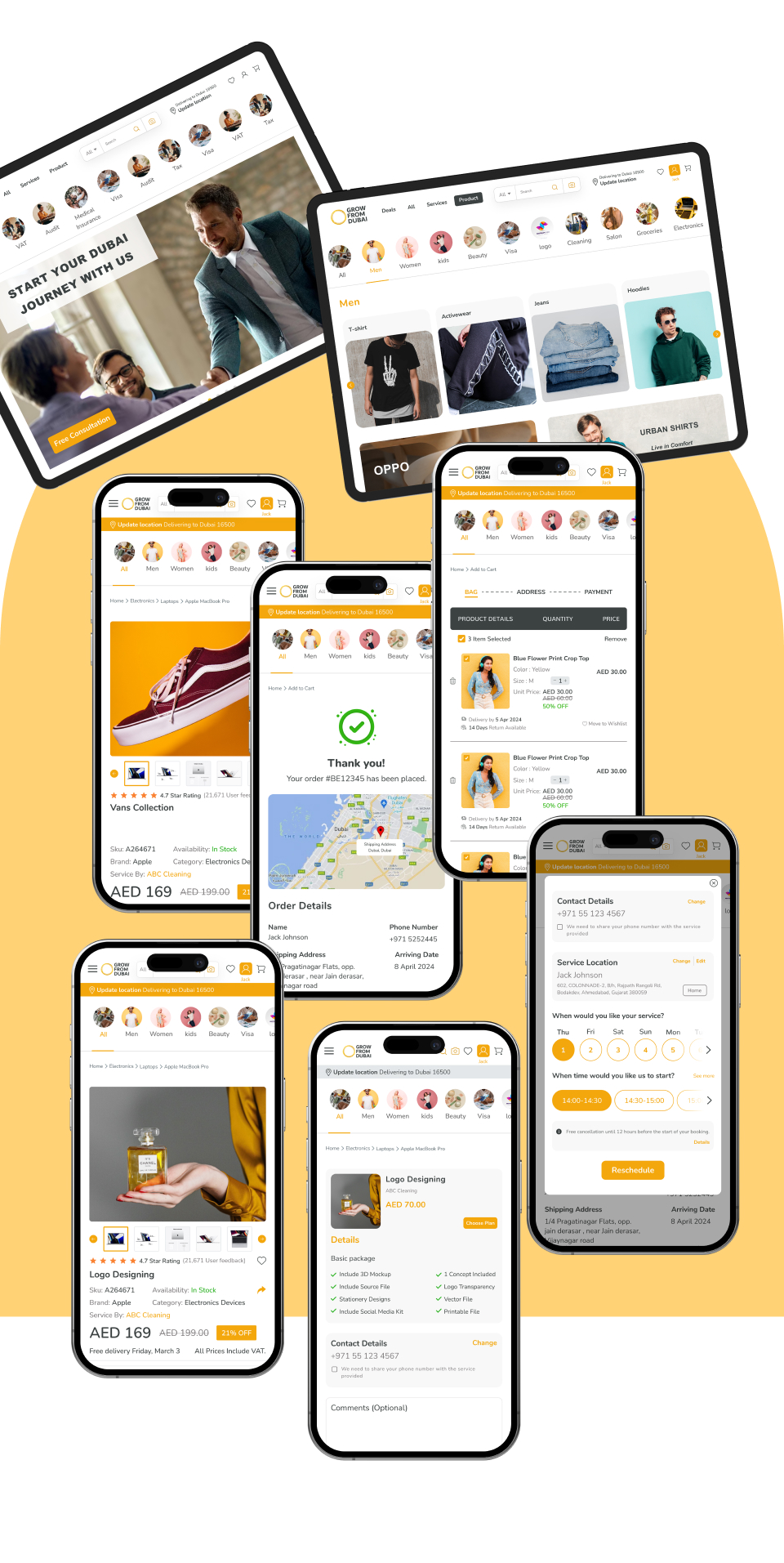
The overall UX
of the screens demonstrates a well-structured and visually consistent design approach, with a clear layout hierarchy and logical user flow. The use of cards, icons, and segmented content helps users navigate the interface easily—from venue selection to booking confirmation. The visual design is modern and user-friendly, which suits a platform centered around bookings or event participation.
However, there is room for refinement to enhance user engagement and conversion. Key action buttons like “Join Now” or “Book” could be more emotionally compelling or goal-driven. Some screens, especially confirmation or promotional views, would benefit from clearer value propositions or added trust elements like user testimonials, success indicators, or security badges. Additionally, subtle interaction feedback—such as slot animations, active state highlights, or soft transitions—would make the experience feel more polished and responsive.
From an accessibility and usability standpoint, increasing tap targets, ensuring strong color contrast, and optimizing layout for mobile interactions would significantly improve the experience. Progress indicators during the booking process and microinteractions when selecting time slots or confirming actions would support user confidence and reduce friction. Overall, the design is off to a strong start and, with thoughtful improvements, can offer an even more intuitive and engaging experience.